I create, shape, build and evolve brands.
With 25+ years of experience, I connect strategy, creativity and leadership to help brands at pivotal moments of transformation, partnering closely with clients to deliver distinctive brand experiences that drive growth, relevance and lasting impact.
Currently, I’m ECD and Global Disciplne Lead of Design at Shell

Dream Big. Do Big.
After the merger, Sunrise faced the challenge of standing out in a market driven by product and price. We created a new brand and repositioned it as a bold challenger, “Dream Big. Do Big.” igniting a step-change that reshaped every touchpoint, from corporate and consumer to CX, and unlocked high-impact platforms like the SwissSki sponsorship.
Rebranding a banking icon
In the wake of declining trust in banking, we repositioned Lloyds Bank by turning its heritage into a modern engine of confidence, creating a unifying brand strategy and fully refreshed identity that brought Retail, Commercial and Private into one powerful masterbrand, aligned through clear, multi-channel systems to rebuild trust at scale.
See your future, own your tomorrow
The Scottish Widows brand was recently evolved, replacing the living widow with a new heroic motif — a stylised red icon — designed to create a simplified, distinctive presence across digital channels. This evolution supports a broader ambition to modernise the customer experience and deepen engagement. We developed the digital ecosystem for all brand assets and experiences, enabling the brand to activate consistently and effectively in market.
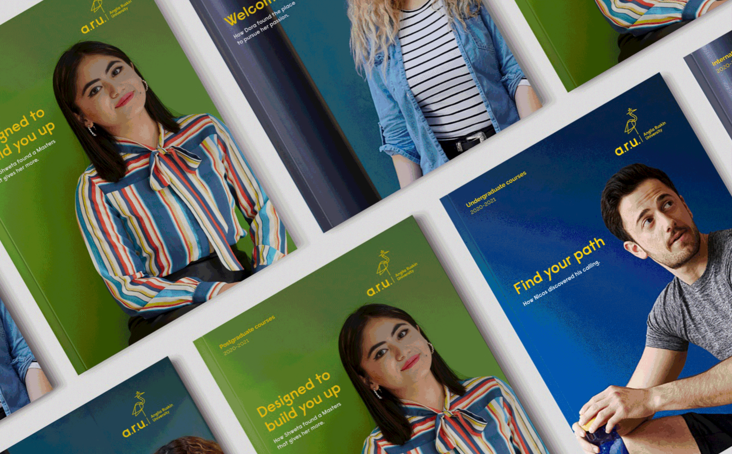
Transforming lives through education and research
Anglia Ruskin University isn’t a conventional university, and we made sure the brand proved it. In a crowded sector, we renamed it ARU and repositioned it with a bold, distinctive identity, reimagining the heron from its crest into a modern symbol of self-actualisation and self-reliance, capturing both its regional roots and global ambition, and turning its values into a powerful, unmistakable brand statement.
Everyday banking - It's a people thing
With the FinTechs posing a threat, Halifax had to make a significant change to the brand which resulted in a new strategy and a major overhaul to its identity. The new identity was designed to be utilitarian and streamlined using bold colours, flatter graphics and a distinct tone of voice. While making use of its heritage of being honest and democratic it now has the modern appeal to stand out from high-street and in the digital space.
Inspiring minds to shape the future
Holtzbrinck, one of the world's largest publishing companies, owns prominent brands like Macmillan and Die Zeit. In an era where truth is increasingly subjective and misinformation is widespread, Holtzbrinck needed a new brand strategy and identity to emphasise its commitment to truth and transparency and aim to positively influence the world.
Creating a world-class pan-African bank
An iconic African brand, Ecobank’s vision is to build a world-class, pan-African bank. With new high-consuming class emerging, with greater levels of disposable income and access to new technologies and information, there is an increased appetite for products and services to be bespoke. We created and launched the new brand Premier Banking by Ecobank across Africa in all key channels (TV, digital and offline).
A new school of thought
Despite being ranked Europe’s number one business school for the past five consecutive years, London Business School were facing aggressive competition from traditional business schools and new entrants. Alongside this, the existing customer promise lacked distinctiveness and the brand identity had become dated, with a lack of consistent application across touch points. We created a new brand, redesigned and rebuilt their digital estate for both Executive Education section and the wider London Business School website.

Reimagining wealth management
W8 Advisory provides specialist and comprehensive expertise from an extensive network to tailor-make the best solutions for their clients. With such a sophisticated, select and small client base, W8 Advisory wants to ensure that they appear bespoke to set them apart from their peers. We took an unconventional approach to a very traditional business. W8 became the moniker for Infinite Wealth Solutions through the coupling of ‘W’ and the Möbius strip symbol. With the communications delivering high production values, we were able to deliver the brand appropriately to their target audience.
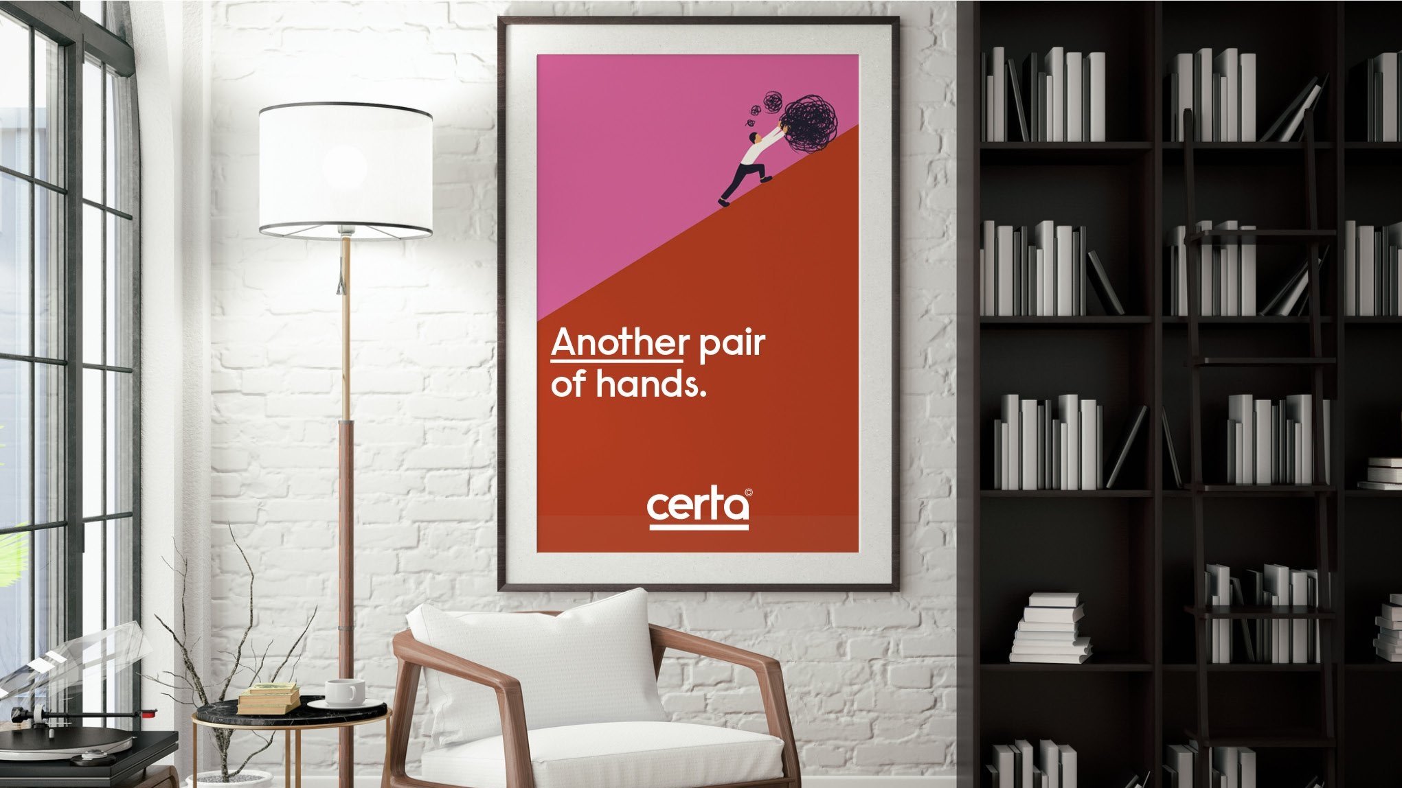
From uncertainty to certainty
Working in an established and crowded market, we created a newco business that could stand out as a leading restructuring advisor. The key was building on the team's relationships and reputations. The outcome was to hero the Certa team confidently and naturally to keep the brand authentic and approachable. In keeping with this positive theme, the tone of voice and design was straightforward, clear, concise and uncluttered. This confident approach has a finite result in view, emphasised by the full point in the name and the definitive underlining of keywords.
Engineering a safer world